

Perranporth Life: Magazine Design, Layout & Advertising
Editorial & Advertising Design · Ongoing Publication
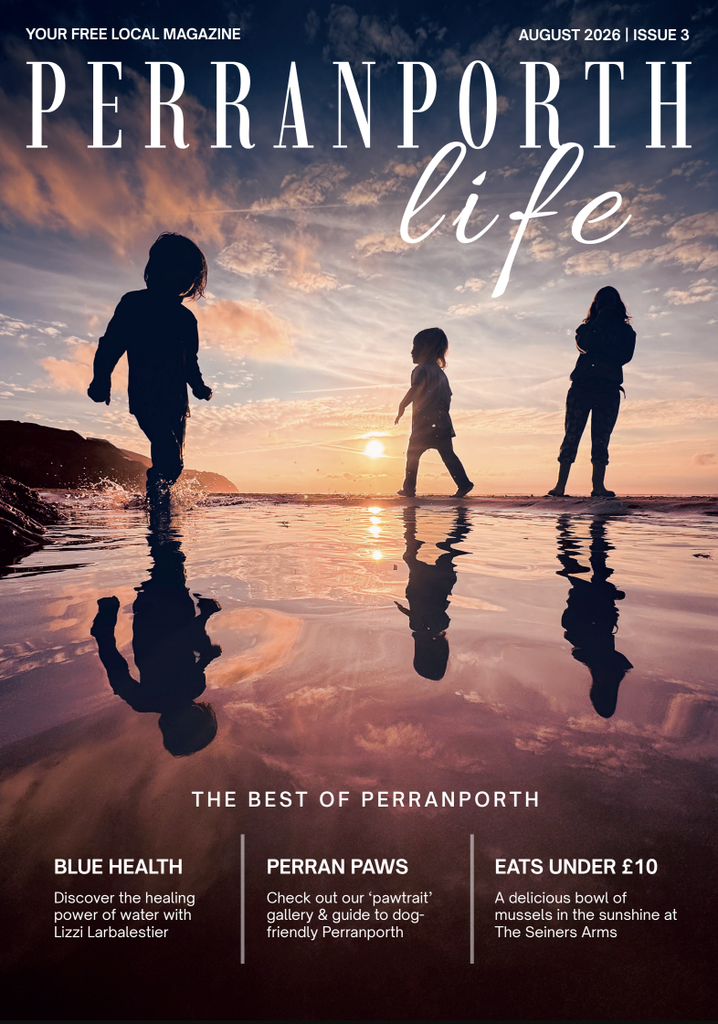
Perranporth Life is a local magazine celebrating the people, places, businesses and stories of Perranporth and the surrounding area.
I am responsible for the layout and design of each issue, working within the publication’s established identity to create a cohesive and engaging magazine from cover to cover. This involves bringing together a wide variety of editorial content, photography, features, listings and advertising, often with different amounts and formats of content to accommodate within each issue.
I manage the visual flow and pagination of the magazine, creating consistency across recurring features while giving individual stories and sections enough space and personality to stand out. Careful attention to typography, image placement, hierarchy and spacing ensures that the finished publication feels balanced and easy to navigate.
Alongside the editorial layout, I also provide advertising design for the magazine’s advertisers. This includes taking information, imagery and brand assets supplied by individual businesses and turning them into polished, publication-ready adverts that work within the visual environment of the magazine.
This combination of editorial and advertising design means I understand the commercial realities of producing a magazine as well as the creative side — ensuring that advertising sits naturally alongside the editorial content while still giving each advertiser a strong visual presence.
The result is a consistent, professionally produced local publication that brings together community stories, local businesses and advertising in one cohesive visual experience.
CLICK HERE TO VIEW THE E-MAZAGINE
Magazine · Editorial Design · Layout · Advertising Design · Pagination · Typography · Print Production
Perranporth Life 2027 Calendar: Design, Layout & Production
Calendar Design · Layout · Brand Identity · Print Production
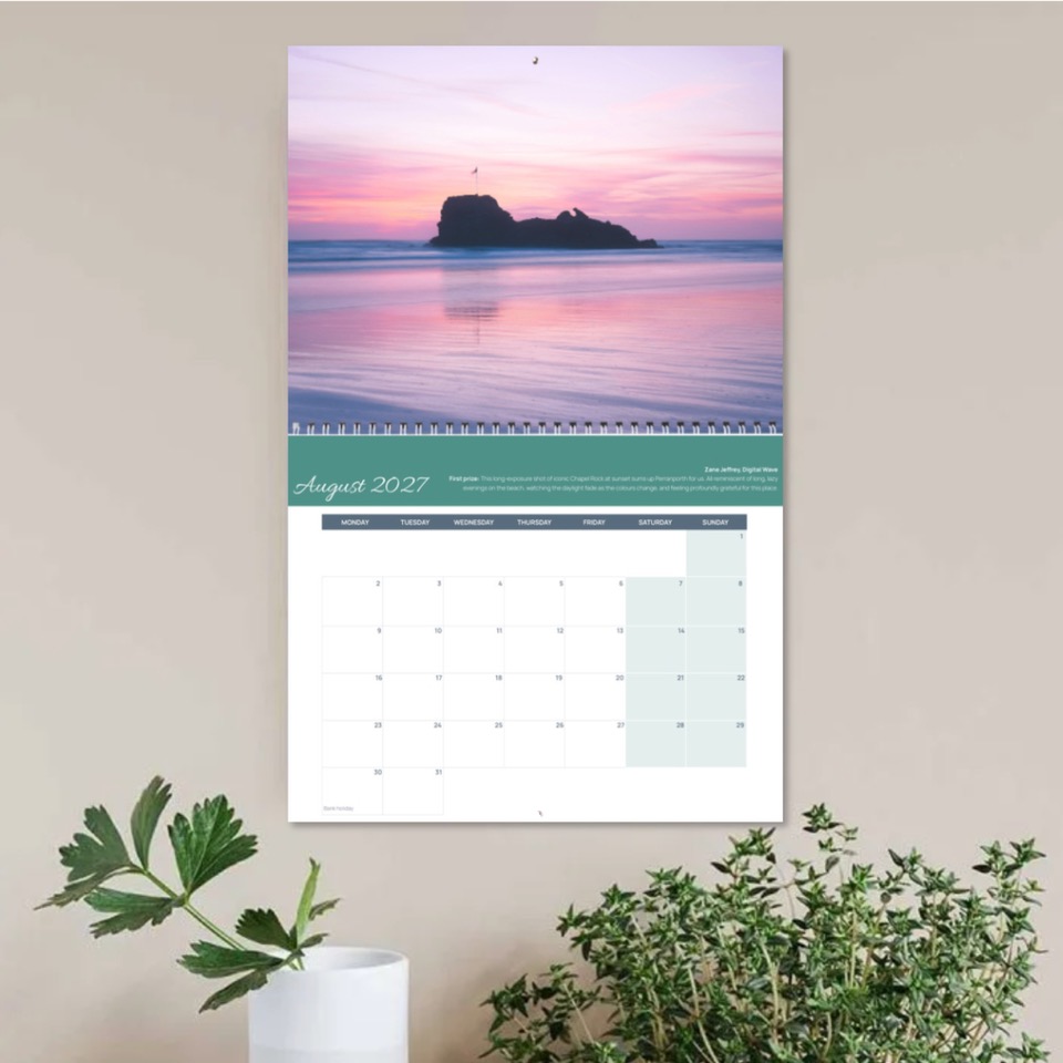
The Perranporth Life 2027 Calendar is a branded calendar celebrating the places, landscapes and character of Perranporth.
I am responsible for the design and layout of the calendar, bringing together photography, branding, dates and supporting content to create a cohesive and engaging design across the full year. The calendar needed to feel recognisably part of the Perranporth Life brand while working as a standalone printed product.
I manage the visual structure and pagination of each month, carefully balancing photography, calendar information and supporting elements within a consistent layout. Attention to typography, image selection, hierarchy, spacing and colour ensures that each page is clear and easy to use while still giving the imagery and local character room to stand out.
The design also involves maintaining visual consistency throughout the calendar, creating a strong connection between each month while allowing different photographs and seasonal content to provide variety. Working with the supplied imagery and established brand identity, I create layouts that feel polished, professional and appropriate for both the publication and its audience.
The result is a professionally designed 2027 calendar that brings the Perranporth Life identity into a practical, year-round format, combining local photography, useful calendar information and strong visual design to celebrate the area throughout the year.
Calendar Design · Layout · Brand Identity · Typography · Photography · Pagination · Print Production
The School Run Entrepreneur: Book Cover, Interior Design & Typesetting
Ebook & Paperback
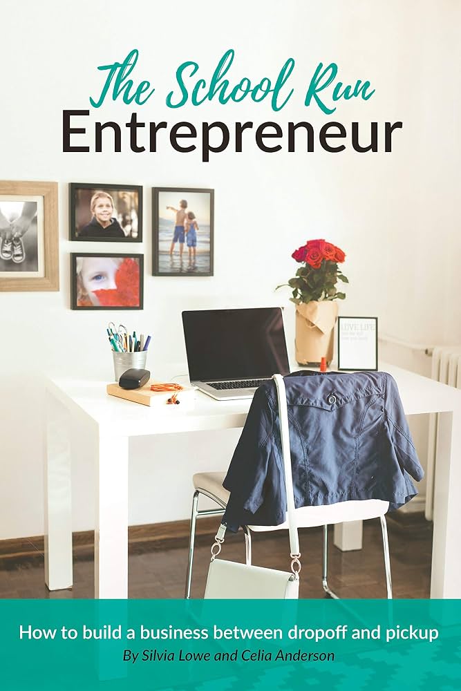
The School Run Entrepreneur is a practical and encouraging guide for entrepreneurial parents looking to build a business around the realities of family life.
For this project, I was responsible for the complete visual design and layout of the book, from the front and back covers through to the final interior pages. The project included creating the paperback cover, including the spine and print-ready artwork, as well as designing and typesetting the complete book interior.
The interior layout was designed to balance substantial written content with a light, approachable editorial style. Clear typographic hierarchy, considered spacing and consistent styling help guide the reader through the book while giving each chapter its own sense of structure.
I also produced the book in two formats: a digital ebook and a printed paperback, adapting the design and formatting appropriately for each medium while maintaining a consistent visual identity across both.
The paperback was prepared as a complete print-ready cover, incorporating the front cover, spine and back cover, while the interior was carefully typeset and formatted for print production.
The result is a cohesive book design that feels professional and polished, while retaining the warmth and accessibility that reflects the subject matter and its audience.
Book · Cover Design · Interior Design · Typesetting · Ebook · Paperback · Print Production